Nicola Smith, National Museum of Australia, 27 March 2009
NICOLA SMITH: Good afternoon everyone, I’m Nicki Smith and I would like to discuss with you this afternoon exhibition lighting guidelines here at the National Museum of Australia.
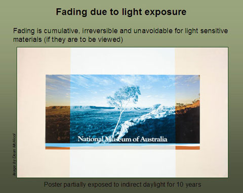
We all know that with exhibitions there comes a cost. We’re aware that light fades some colours and materials. Fading is cumulative, irreversible and unavoidable for light sensitive materials, if they are to be viewed. We know the amount of fading is dependent on the specific material, the intensity of the light and the length of exposure. So, logically, conservators have been recommending display of light sensitive materials at low light levels for reduced periods of time.
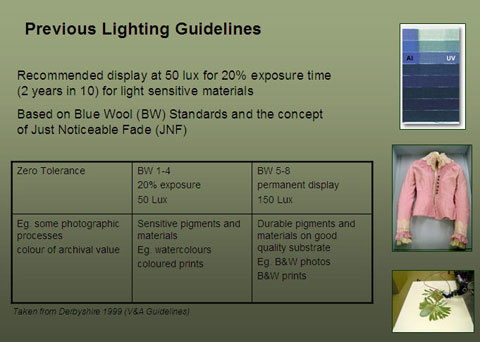
When the National Museum of Australia Acton building opened in 2001, our lighting guidelines were based on the lighting guidelines of the Victoria and Albert Museum in the United Kingdom. We recommended display at 50 lux for 20 per cent of the time - that is usually two years in ten years - for sensitive materials such as paper and textiles. The V&A guidelines were based on a comparision with Blue Wool Standards. These are international standards of eight blue dyes on wool which fade at a known rate and typically, if there is no UV, each one in a step-wise process fades about three times slower than the adjacent one.
You can see in this Blue Wool slide [shows image] the first one, Blue Wool 1, has faded considerably down to Blue Wool 2, also faded 3. By the time you get to Blue Wool 4 you are only just seeing a bit of fading and Blue Wool 5, I can’t really see any fading.
The guidelines are also based on the concept of a just noticeable fade. This is a set amount of colour that we define as being ‘just noticeable’. The V&A taking a risk management approach decided one just noticeable fade in 50 years was an acceptable change. This gave an approximate useful colour life of an object of around 500 years.
The major benefit of these previous lighting guidelines was the introduction of a risk management philosophy. However, there were also some negatives. Firstly, 50 lux was based on the ability of young, healthy college students to differentiate colour based on the rods and cones in the eye. By the time we reach 40, we need considerably more light just to see the same amount of detail. So we need to consider if we are meeting the needs of our visitor demographics.
Secondly, what little fading information on dyes is available usually comes from materials typically found in European museums. There is no virtually fading information available on materials that are common in our collection. Nor do we take into account that initial fading is rapid but that it gradually slows over time. Because of this little understanding of the light fading of our collection, the tendency has been to be cautious and to place coloured organic material in the two years, 50 lux changeover regime.
Thirdly, the guidelines averaged across the Blue Wool 1 to Blue Wool 4 category. There is an approximate 30 times difference in fading rate between Blue Wool 1 and Blue Wool 4. This means Blue Wool 1 and 2 are considerably overexposed; whereas Blue Wool 4 is overprotected. Conservators knew some material was not being protected adequately and so, even though it wasn’t in our guidelines, some of our material was actually changed over every three months. Once one institution says its works have to be changed over every three months, then surely it would be remiss or negligent if every responsible institution didn’t do the same. It’s the problem of creeping conservatism.
The result was our changeover program became unsustainable in terms of object replacement and staff resources. Unique objects simply could not be replaced, and many staff spent the bulk of their time developing and changing over objects and modules. In 2006 a forward changeover estimate for two galleries - the GFA (Gallery of First Australians) and the Eternity gallery - for a ten-year period was estimated at 1000 objects. We were also under serious pressure from management to justify the cost. What we needed was to be able to differentiate our collection into those that were fast faders, those that were moderate faders and those that were light stable. What we also needed was to further our risk management approach.
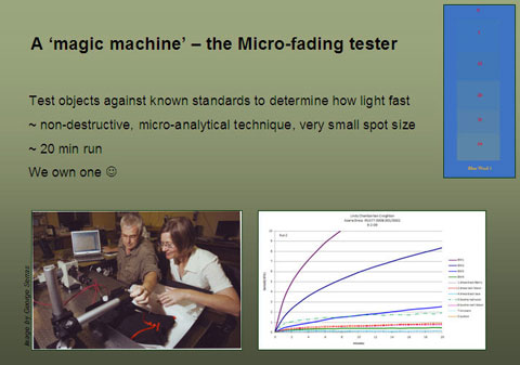
Lucky for us we weren’t alone in acknowledging our changeover regime was unsustainable. Other institutions had also been working on this, and a prototype light fading machine has been developed. There are about eight currently in existence, and we have one. This micro-analytical technique is essentially non-destructive. The object is exposed to a tiny pinpoint of very bright light. The pinpoint is about half a diameter of a small full stop. The change in colour of the spot is recorded and compared against the Blue Wool Standards. In 20 minutes we can compare fading rates equivalent to hundreds of years on display. Of course, as with any accelerated ageing there is always going to be limitations and assumptions, but we can say with confidence we know infinitely more about the fading rates of our collection than before we had this machine.
[shows image] Here you can see Bruce and I investigating Azaria Chamberlain’s dress and booties. The X axis is time and the Y axis is rate of colour change. The solid lines are Blue Wool 1, Blue Wool 2, Blue Wool 3 and Blue Wool 4 down the bottom. You can see there is initial rapid change that gradually slows off over time. With the red booties, this blue dotted line sitting around equivalent to Blue Wool 3; the red ribbon and the red buttons are sitting just above or slightly worse than Blue Wool 4; and the black dress is more stable than Blue Wool 4.
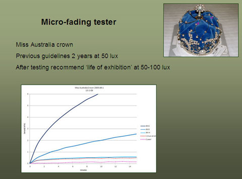
Another object we have tested is the Miss Australia crown. Because of its textile component, in our previous lighting guidelines we would probably have been cautious and recommended display for two years in ten at 50 lux. If people don’t understand 50 lux, if you go out into the Australian Journeys gallery and you are looking at dim light, that is 50 lux. If you are sewing a button at home and you need bright light, that is about 1000 lux. If you go outside in Canberra daytime it is about 100,000 lux.
Number 1 is a spot of blue velvet that was tested. You can see it is sitting - and again we only have Blue Wool 2, Blue Wool 3 and Blue Wool 4 as the solid lines. We haven’t included Blue Wool 1 because it is not relevant. The textile is more stable then Blue Wool 3 and the pearl, the second spot, is considerably more stable than Blue Wool 4. We are able to recommend, if it is requested, that it can stay on for the life of exhibition at 50 to 100 lux.
I am going to slip over the next slide because I am conscious I have to keep to my ten minutes. Suffice to say you can see in the top corner that the set-up for the machine is pretty simple. It is semi-portable as well.
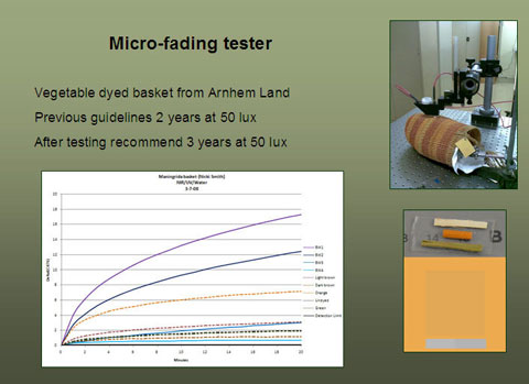
This is a Maningrida basket, an Arnhem Land basket. The most sensitive dye is one of the orange vegetable dyes sitting around between Blue Wool 2 and 3. We can also use that data to estimate what it could look like after 50 to 100 years of display.
What we are currently working with is a guideline that groups material types into fast faders (that is Blue Wool 2-3); moderate faders (Blue Wool 3-4); and materials that are basically light stable sitting at Blue Wool 4 and above. I haven’t included Blue Wool 1 and 2 because they fade so fast that they should always be set on an individual basis.
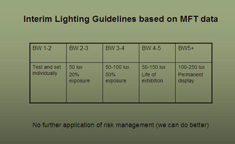
I guess I should put it a bit in context because some of you may not know what types of materials would be typical in here. Ones that are extremely sensitive would be early aniline dyes from the 1890s, maybe some blueprints or pristine Japanese prints. Things typically sitting in Blue Wool 2-3 would be vegetable dyes like the Maningrida basket I mentioned on the last slide. Blue Wool 3-4 we now aware is the bulk of our organic collection that has seen some display in the past. Blue Wool 4-5 is the more stable organics like shell, hair and resin that are slightly less coloured than the Blue Wool 3-4. Blue Wool 5 and above, up to Blue Wool 8, typically is shell, stone, metals.
Although it is possible to rate objects with far greater resolution than these broad light fast categories, it would not be cost effective to test every single object, and the results so far indicate most material types have been fairly consistent. The beauty of having the machine is that, if we are concerned about a particular object, we can test it. We estimate using this type of guideline that the 1000-object estimate for the changeovers across the Gallery of First Australians and Eternity would be reduced to around 300. We believe this is a step in the right direction, but it is not furthering the application of risk management and we can do better.
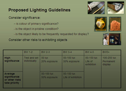
What we actually want to do is to move away from such a prescriptive approach to lighting guidelines. Instead, we want to incorporate significance and other potential risks to have a more reasoned and holistic approach to exhibitions. As I think Charlotte [Smith] mentioned this morning, most museums have less than one per cent of their collection on display, and the remainder is in hopefully dark storage. A small number of objects are used frequently; a moderate number of objects go on display infrequently; and a large number of objects never go on display.
What we want to discuss with curatorial staff are questions like: is the colour of primary significance? Is the object in pristine condition? Will it be frequently requested for display?
All the guidelines discussed so far have been based on the decision to allow one just noticeable fade per 50 years. We want to include the commonsense idea that, if an object is not going to be displayed very often, it can be moved up one category in the lighting guidelines. I am primarily referring to the category of Blue Wool 2-4, because Blue Wool 1-2, as I have already said, is highly sensitive and should be set individually. Blue Wool 4 and above is already on for the life of the exhibition at least.
Just as we need to consider if colour is of primary significance, we also need to consider what are the other risks towards exhibiting an object. For bark paintings or pukamani poles which have light fast pigments, the need for interventive treatments and the risk of paint loss from handling, transport and fluctuating environmental conditions may be of far higher risk than a minor colour of a PVA binder.
We could also argue that colour is not of primary significance for Phar Lap’s heart. Most colour was lost during the fixing process. If the heart changes slightly, we are still able to interpret the object. However, if we subject Phar Lap’s heart to damaging handling or vibration and if we alter the size or physical composition of the heart, the interpretation of the object would be severely compromised. We currently have Phar Lap’s heart on display in a vibration dampened case and, because we like to be careful, we also have a lighting sensor to minimise any unnecessary light.
We estimate that if we used guidelines incorporating significance and risk, we could have decreased the 2006 ten-year forward estimate of changeovers from over 1000 to less than 50.
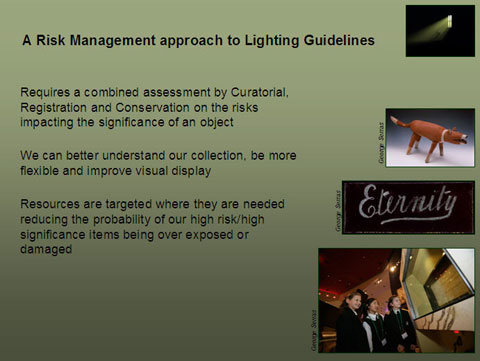
To conclude, a risk management approach to lighting guidelines requires a combined assessment by curatorial, registration and conservation on the risks impacting the significance of an object.
On my previous slide I was going to talk about significance. There are guidelines for assessing significance, and most curatorial staff have worked on this. It’s a requirement for inclusion into our National Historic Collection for objects to undergo an assessment of significance.
It also means we can better understand our collection, be more flexible and actually improve our visual display. It also means that our resources are targeted where they are needed, reducing the probability of our high risk/high significant items being exposed or damaged.
While I am acknowledging a few people I will put up a slide showing a selection of the items we have tested so far.
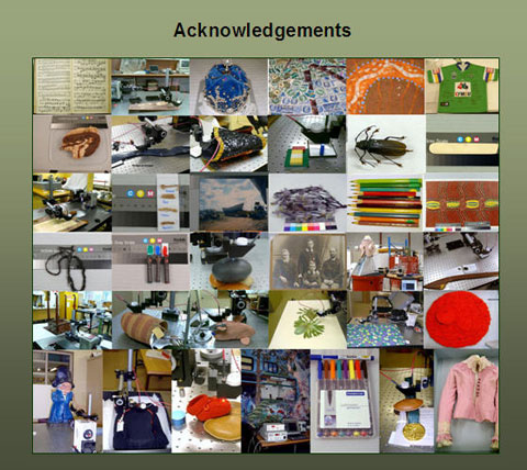
I would like to acknowledge the Photography section at the National Museum. All the photos, if they weren’t acknowledged here, were taken either by Bruce or myself. I would like to mention the Conservation section and in particular David Hallam plus our general manager and director for supporting this research. Apologies from Bruce who was invited to go to Amsterdam on a user group meeting for using the micro-fading tester. I was glad to hear this morning that training conservation students was easy and I am looking forward to working with some of them in the future.
QUESTION: By Guy Hansen. In that initial phase how do you determine when an object has done most of the fading that it is going to do? Is it just that the vibrancy of the colour is gone or do you need to do some further testing?
NICOLA SMITH: Because we have the machine we can test it. We can’t say just by using the machine how much fading has happened but we can look at where it is currently and see how rapidly it is changing so that we can place in an equivalent to a Blue Wool 4, Blue Wool 3 or Blue Wool 2. It is about recognising that if, for example, you have an Ernabella textile and we may say, ‘It is an Ernabella textile; it is going to be around Blue Wool 2 or 3’ but actually if it has already been outside for six months, if someone has been wearing it or if it’s been in an historic collection where it has been exposed to light in the past, it has already done its initial fading and it’s tracking along on a different path. So it has moved from, say, Blue Wool 2 and may be sitting around a Blue Wool 3 or 4.
Disclaimer and copyright notice
This is an edited transcript typed from an audio recording.
The National Museum of Australia cannot guarantee its complete accuracy. Some older pages on the Museum website contain images and terms now considered outdated and inappropriate. They are a reflection of the time when the material was created and do not necessarily reflect the views of the Museum.
© National Museum of Australia 2007–26. This transcript is copyright and is intended for your general use and information. You may download, display, print and reproduce it in unaltered form only for your personal, non-commercial use or for use within your organisation. Apart from any use as permitted under the Copyright Act 1968 (Cth) all other rights are reserved.
Date published: 01 January 2018